Here… no, here…
Hmmm, still not quite right.
Maybe here?
Small adjustments to a design, just a few pixels, can completely throw off an entire design.
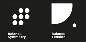
Placement of objects in space in relation to other objects when done right, creates a peaceful balanced feel, when done wrong, an irritating and agitating experience. Balance is about feeling, it is difficult to teach, you can show them, but it takes feeling it out from practice to really understand balance.
Another thing that can help is adjusting the weight of one of the objects. If they are both the same size, and it doesn’t seem to be working on the page, then make one much bigger and maybe add a medium-sized shape. The scale of the object creates a tremendous difference when playing with the balance of a design.
Grids can also be your best friend. Laying out a grid and then using that to correctly place objects evenly was kind of a huge life hack for me when I first found out about it. It saves so much time by preventing me from having to nudge and adjust a design to look juuust right!
Learning how to balance a design well is essential to designing anything, It’s an essential skill to master as a designer. Find your center, find your balance.